Comoda: brand identity for a fashion swap
In 2014 I decided to convert my growing interest in sustainable fashion into my BFA diploma project: developing and promoting a fashion swap brand.
My role:
• research & competitive analysis
• visual design
• marketing strategy

Research: benchmarking & SWOT Analysis
The concept of barter-based clothing exchange was not a new invention at all: web portals such as “Szafa.pl” were quite successful at the time, with over 2 millions of unique users swapping and/or selling goods through the website (Source: company’s press release from 2013). At the same time I struggled to find an on-site event of similar character in my hometown. I expanded the search area to other major polish cities and managed to find a few one-time swaps, usually organized as a side-attraction of another bigger event.
A SWOT analysis of in-person swapping helped me figure out the desired characteristics of my future brand:
• focused on sustainability: targeting people that are already interested in fast-fashion alternatives
• low-cost: the starter pack to organize an event should be cheap to manufacture and possibly allow multiple uses
• collaborative: by building a strong, like-minded community of fashion enthusiasts
Naming, mission & vision
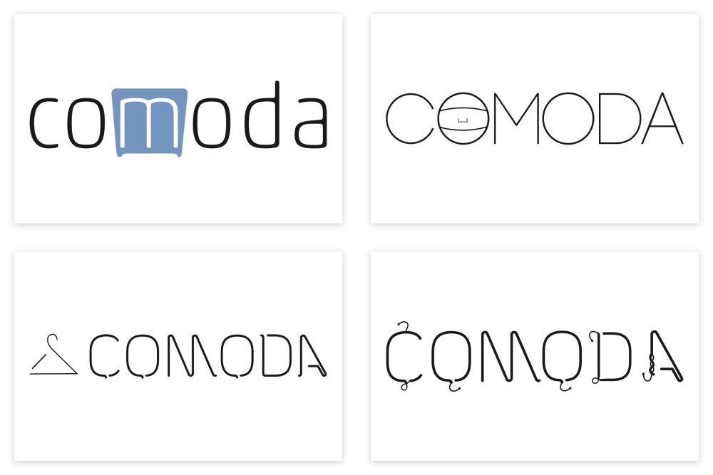
After a few brainstorming & mind mapping sessions I decided on the name “Comoda” (meaning a chest of drawers in Polish), which is supposed to be read as co-moda (our-fashion), signaling the social aspect of barter-based events.
Mission:
“Offer a sustainable and eco-friendly alternative to fast-fashion and overconsumption of clothes.”
Vision:
“Empower people to take action and support the conservation of the environment without sacrificing style, by providing them with a platform to exchange pre-loved fashion items within their local communities.”

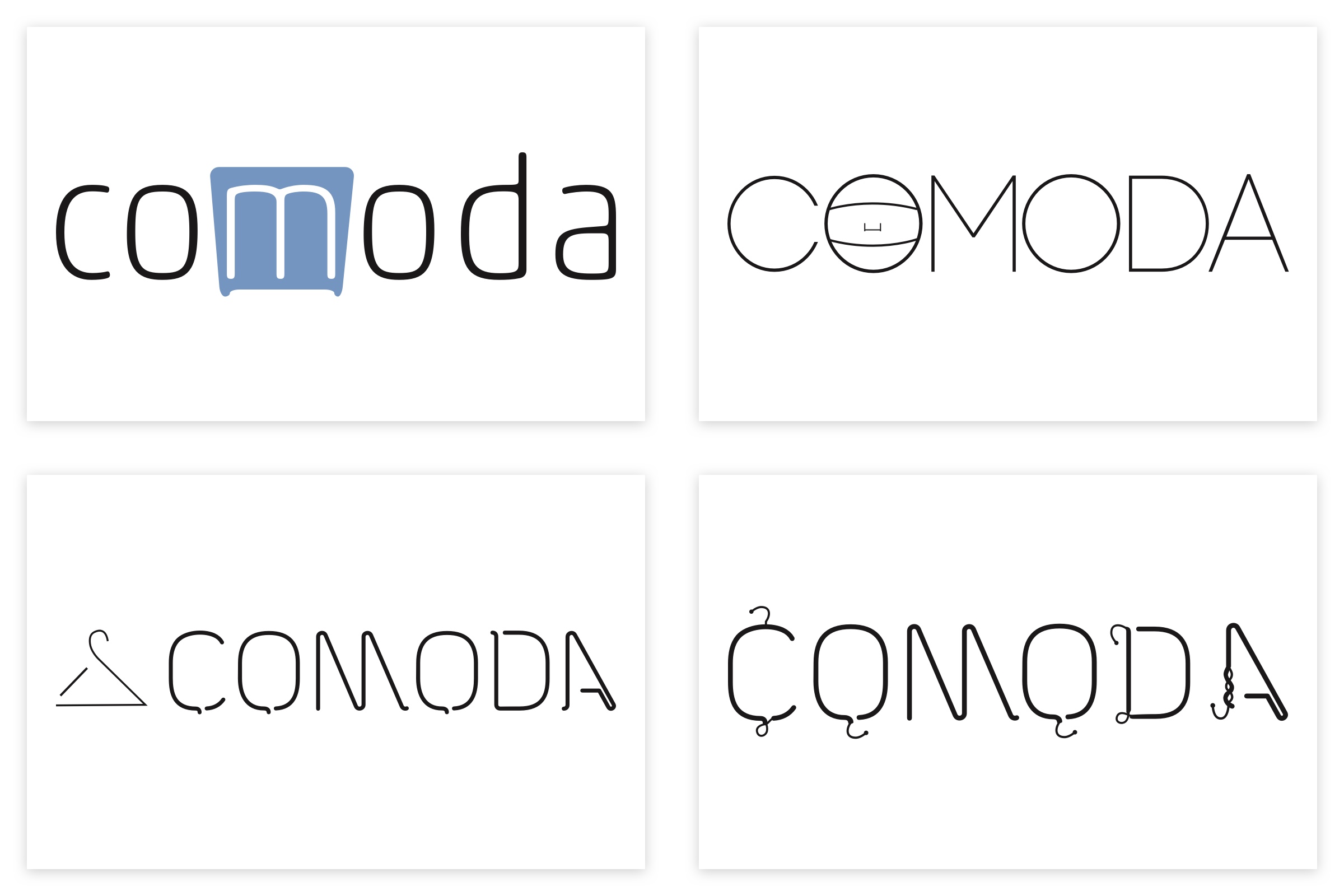
Logo design
I chose to incorporate a hanger directly into the logo, after playing around with oldschool wire hangers in search for inspiration. In order to avoid the “high-fashion” feel I opted for a display typeface that imitated a cable/bent wire, giving it a more casual style.
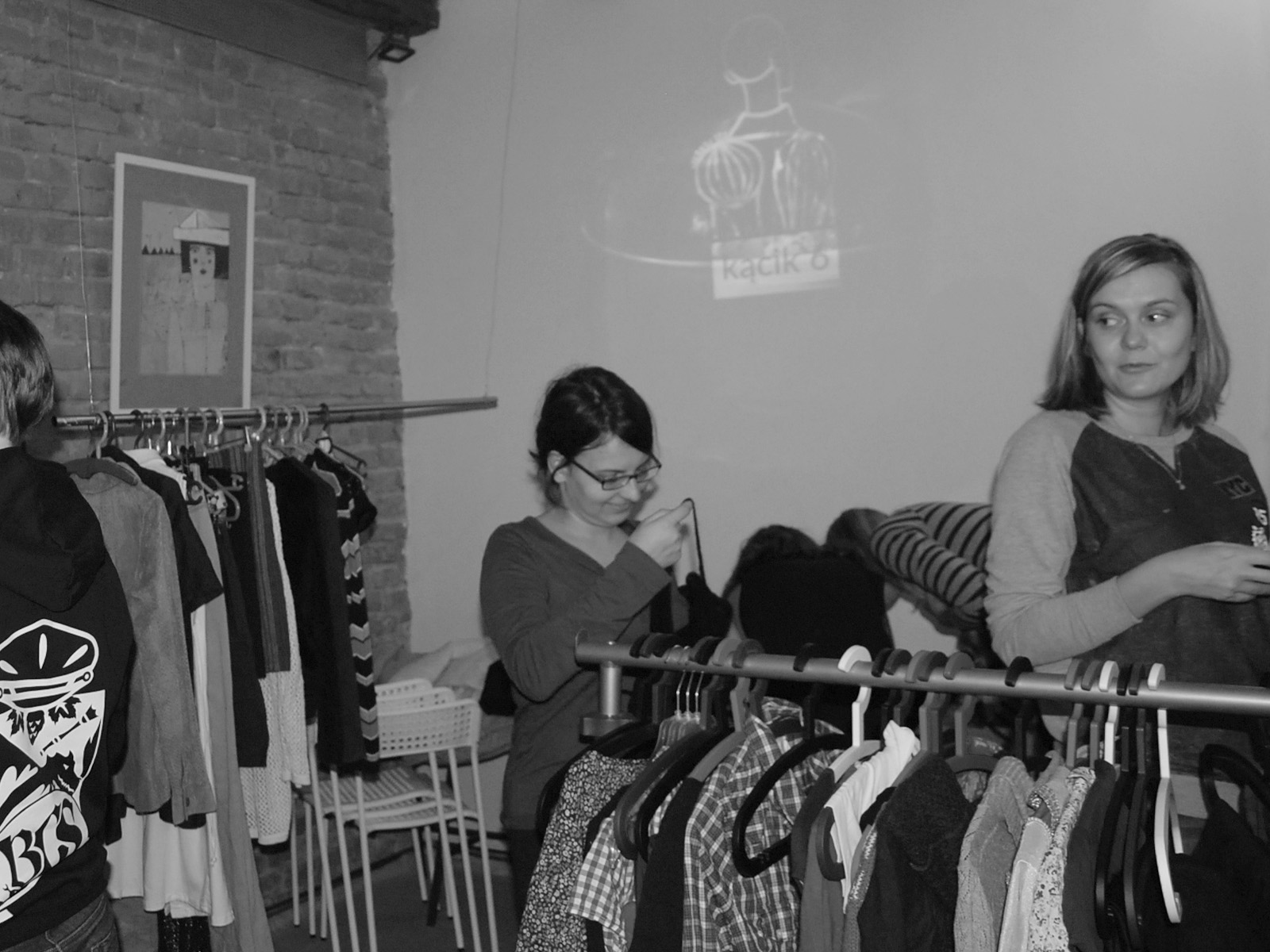
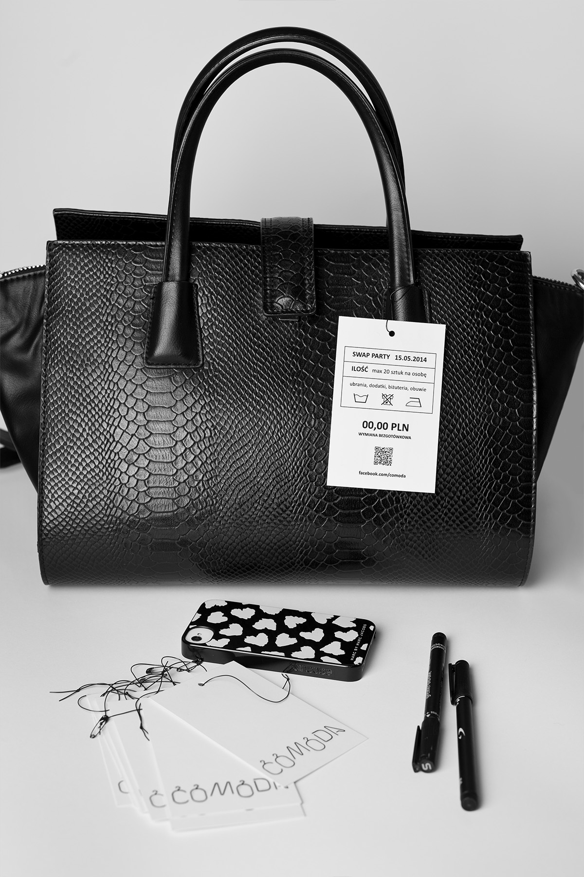
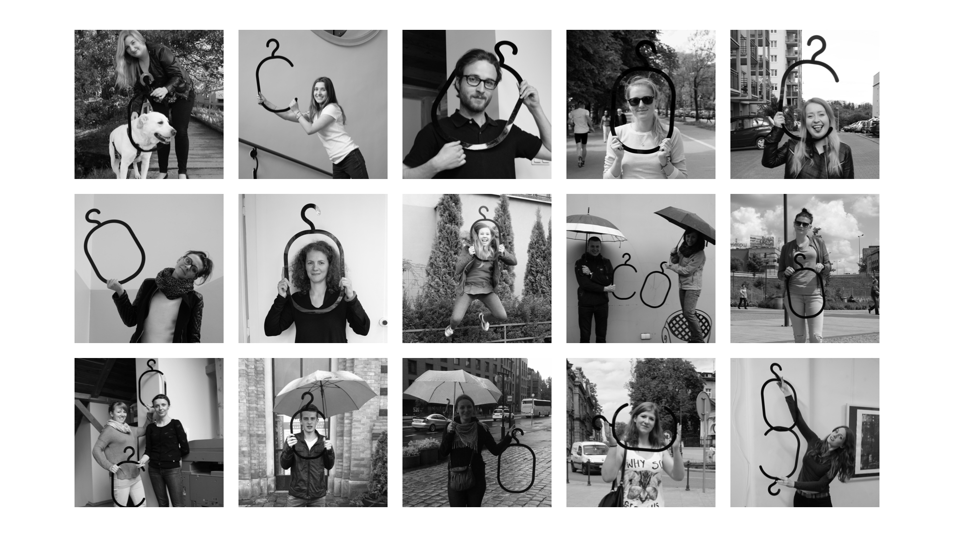
The final version of the logo got laser-cut in black plexiglass and received its own mini-photoshoot as a part of the promotional campaign. A few of the hanger-shaped letters were used to hang clothes during the actual event.
Promotional starter pack
In order to facilitate additional printing (if required) the color palette of the promotional materials was limited to black & white. That way all the tags and leaflets can be printed on a normal home/office printer, in an environmentally-friendly way.
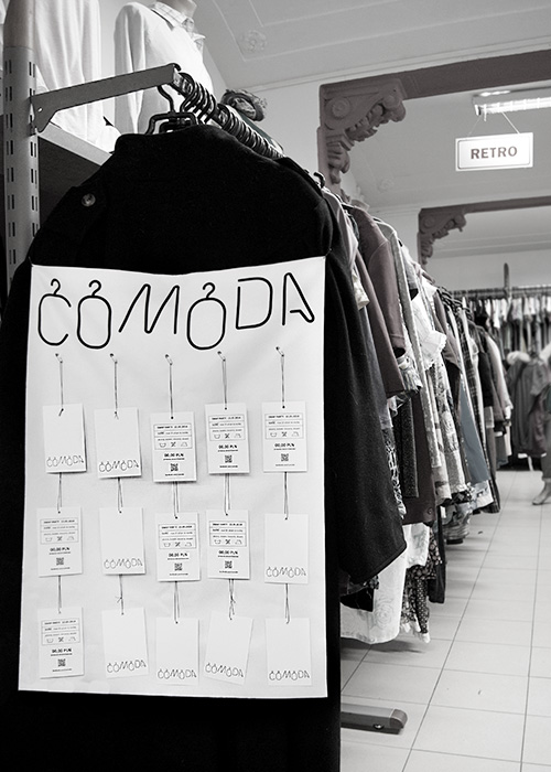
Keeping in mind the idea of sustainability all Comoda’s posters (doubling as flyer holders) got printed on canvas, which allows them to be used repeatedly. The flyer itself contains all the basic rules of the event: date, maximum number of pieces of clothing/accessories per person and a reminder about washing and ironing.
Clothing tags, prepared for the participants of Comoda swap, include an important reminder about the non-profit-making character of the event.


Advertising
Considering the local character of the event I decided to focus on word of mouth marketing, spreading the word via social media, regional forums and online swapping platforms. The offline part of the campaign consisted of hanging several posters at the local universities and vintage shops.
Building a strong community around the Comoda brand was one of the most important aspects. Instead of featuring professional models in the promotional photoshoot I picked more authentic brand ambassadors: friends, coworkers, university colleagues etc., people who were genuinely interested in the event. They all helped with promoting the swap within their own social circles.

Outcome
In 2014 I hosted and co-organized four Comoda fashion swaps in my hometown, Krakow. One of them was a junior edition, focused primarily on children's fashion and maternity wear.