Oasis Wildlife Fuerteventura
My role:
• Design of the brand applications
Oasis Wildlife Fuerteventura is one of the biggest zoos and botanical gardens in the Canary Islands (Spain). It’s home to over 250 different species of animals and about 1500 species of plants.
Challenge
The wildlife park, at the moment known as Oasis Park, felt the need to refresh its slightly outdated brand identity, including the name itself. Their main goal was to change the public’s perception of them being just a zoo, with all its possible negative connotations. New brand had to put an emphasis on wildlife conservation, education and research – the backbone of their activity.

Execution
In 2019 We Are Marketing developed an extensive rebranding strategy for Oasis and its four sub-brands: Wildlife, Botanic, Market & Chequipa Foundation.
Mission, Vision & Tone of voice
The brand’s vision was to become an actual oasis, a paradise-like place celebrating nature and wildlife.
Oasis aims to do so by allowing the visitors to reconnect with nature, have fun and enjoy their time in an environmentally conscious way. People visiting the park will have a chance to create unique memories with their loved ones, at the same time learning about the importance of flora & fauna conservation.
The Idealist and The Hero were the two archetypes determining the brand’s main characteristics and placing it in between the Joy and Science territories. The brand should combine the seriousness, reliability and professionality of wildlife conservation with the creative and inspiring educational side.
Oasis’ voice should transmit warmth, inclusivity & happiness. Their tone should be educational but not authoritative. They aim to inspire all the park visitors, make them feel involved in the conservation project – every effort counts, no matter how small it may seem.
Visuals
Both typefaces – Quench and Mikado – were chosen because of their playful and relaxed character, as well as their organic, nature-inspired shapes. The exceptional bubbliness and roundness of Quench letters made them a great graphic resource, distinguishing the brand from its competitors, even if the logo itself was not very prominent within the layout.
The principal color palette could be described as bright, enthusiastic & warm. It aimed to represent Oasis’ passion about wildlife conservation. Each sub-brand received its own, nature-inspired complementary palette, as well as a selection of stencil patterns.
Photography art direction should transmit the care and wellness of animals, show nature with respect and admiration. Staged photos of the staff should be avoided, instead portray them in their everyday tasks. Key concepts: Ease, Warmth, Commitment & Professionality.
My role
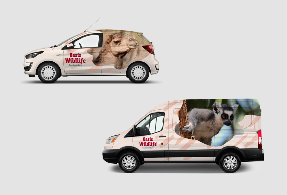
I was responsible for preparing the brand applications, following the general look & feel proposed by the lead designers. Examples:
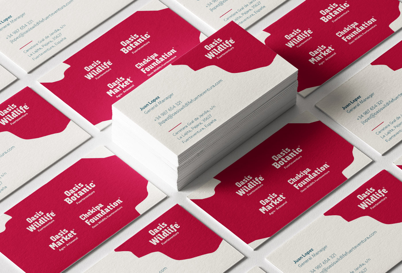
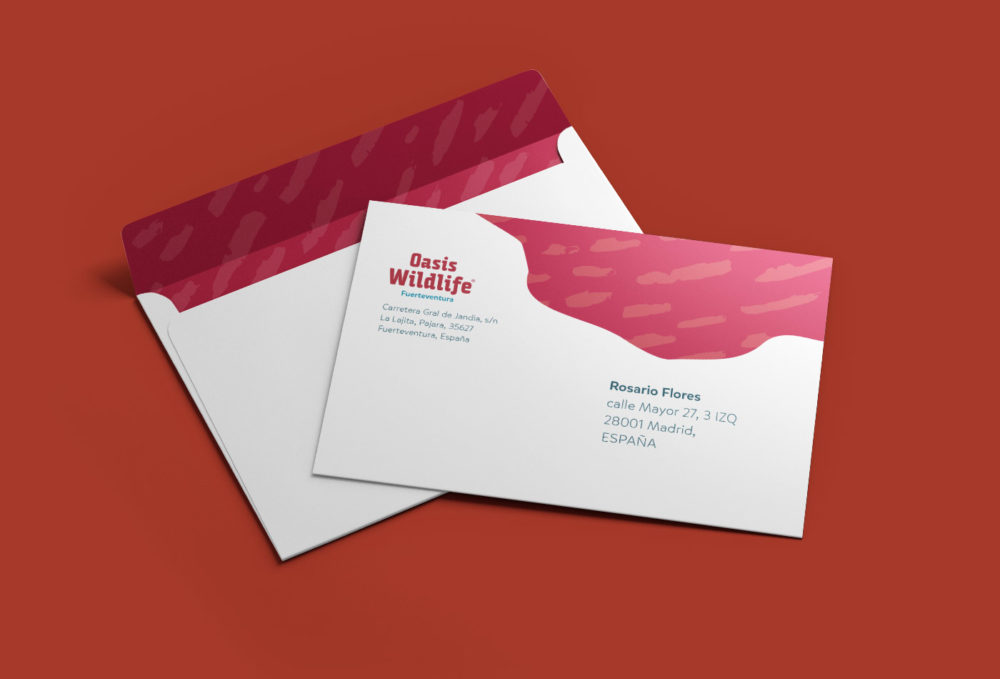
- stationery & business cards
- vehicle branding
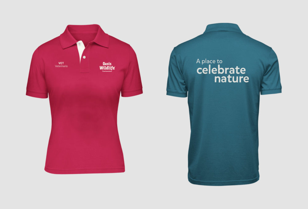
- staff uniforms
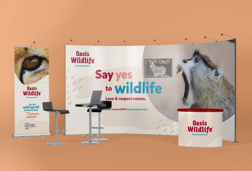
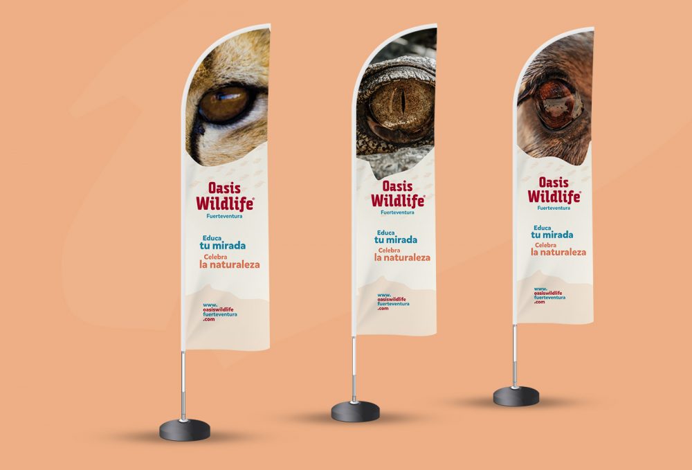
- event branding materials: stand, photocall, banners, etc.
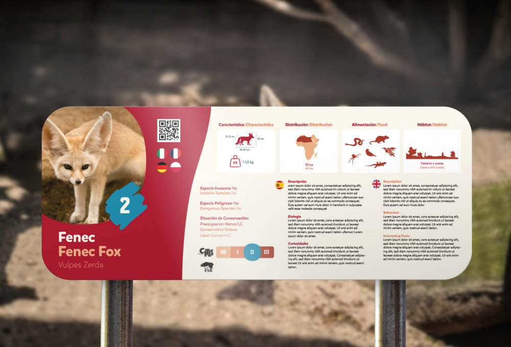
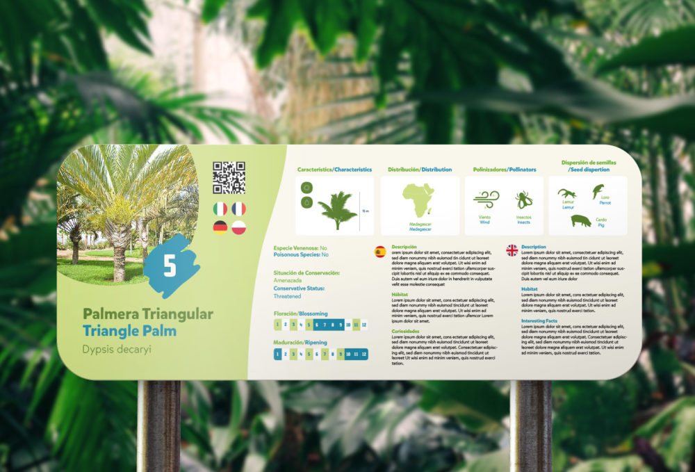
- signage for the park
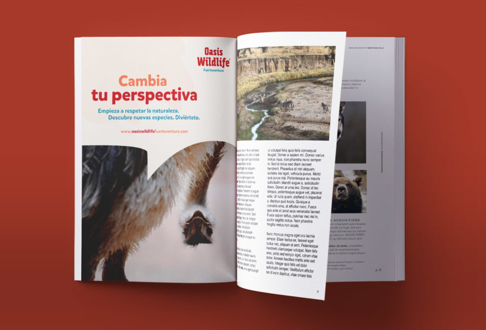
- advertising (e.g. airport posters, magazine ads)


