Growth Lab
My role:
• Brand Identity & Strategy
• Visual Design
Growth Lab, founded in 2020 by Javier Viñas (growth hacker, web analyst & self-described “spreadsheet nerd”) is a group of digital product experts, passionate about data and marketing automation.
Challenge
The Growth Lab initiative has been long-brewing in Javier’s mind – initially it started as a series of lectures and workshops about growth hacking and digital marketing. Our biggest challenge was to successfully transform a purely educational product into a B2B/B2C business, branching into the following services:
- digital analysis & optimisation for B2B clients
- educational services for B2C.
“Life's too short to build something nobody wants.”
– Ash Maurya, author of “Running Lean”

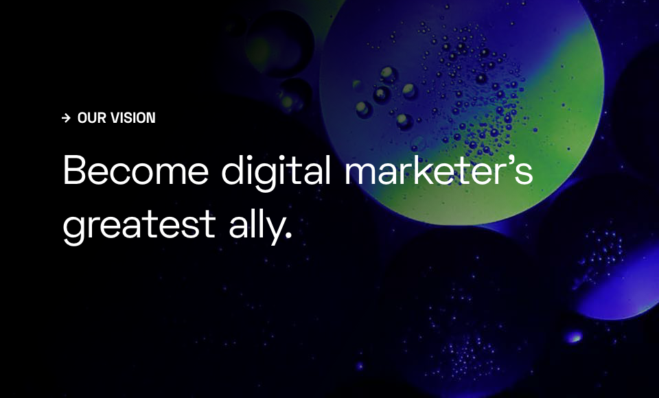
Mission, Vision & Brand Personification
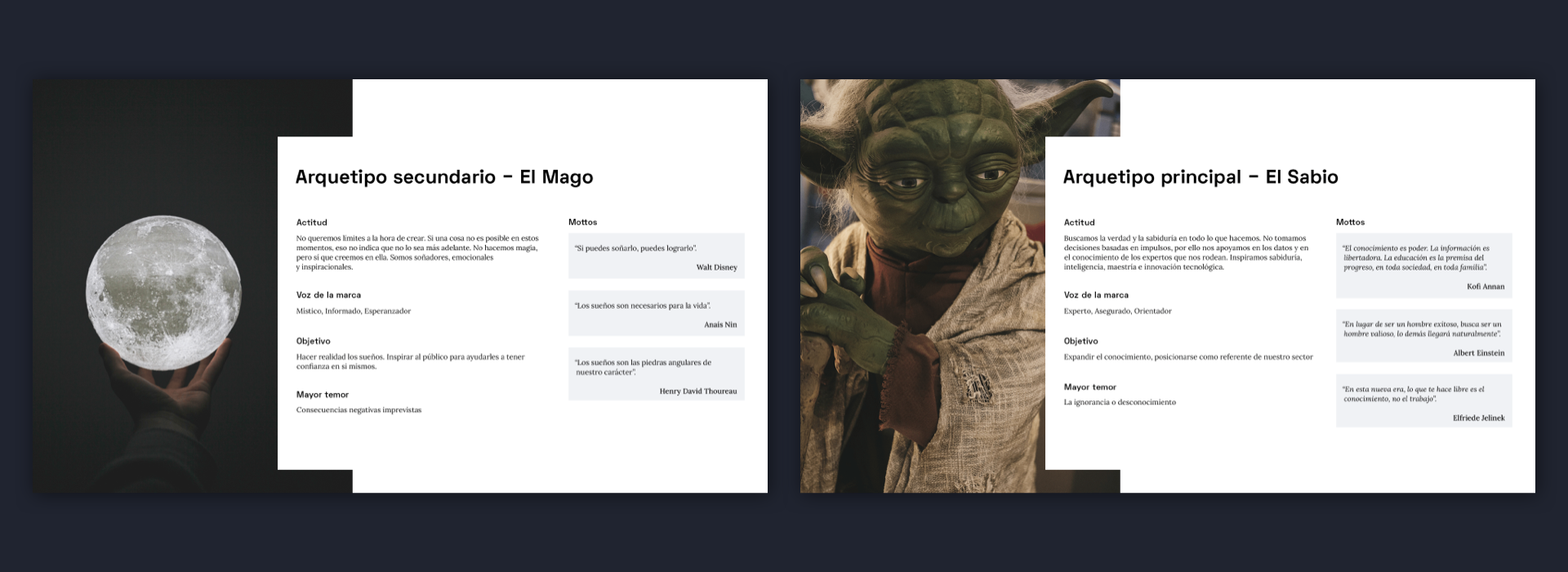
To prepare the complete brand strategy I had to correctly identify its main attributes. In order to do so I conducted a few branding exercise sessions with Javier. During the first workshop we defined the mission & vision statements, as well as the brand’s archetypes:
- The Sage (principal) – helping people better understand the world, by providing practical information and analysis,
- The Magician (secondary) – helping people transform their world, inspiring change and expanding consciousness.
Based on that we synthesized the most important qualities, which would become the brand´s main characteristics and influence its tone of voice, customer approach etc.
Restless – Curiosity is the driving force that keeps us going
Decisive – Characterized by our pragmatic approach
Caring – Wishing to help out in whatever way we can
Committed – Always keeping our word
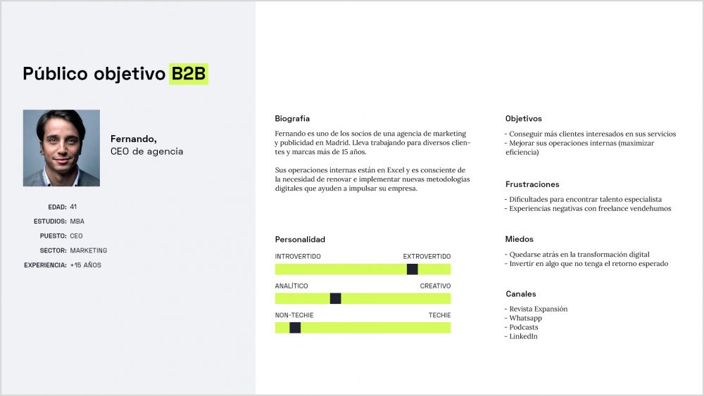
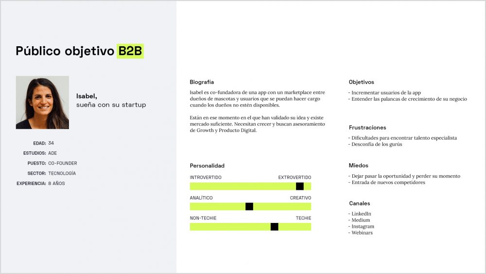
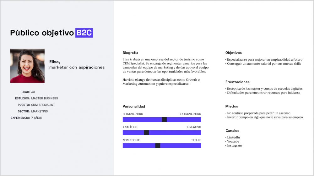
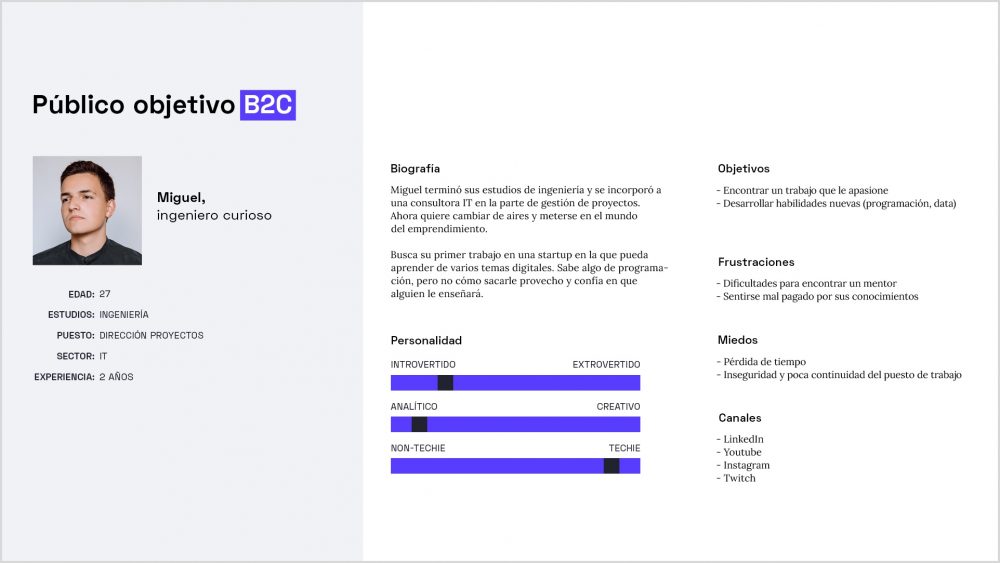
Target Audience
In order to understand who we want to reach, where to find our potential clients and establish how we should communicate with them we conducted another brainstorming session with Javier. We defined two main User Personas per each business line.
Next we worked on the tone of voice guidelines. Since the digital marketing world can easily turn into a minefield, filled with confusing terminology and buzzwords, Growth Lab’s main goal was to always communicate clearly, avoid technical terms and demystify certain concepts, without being patronizing.


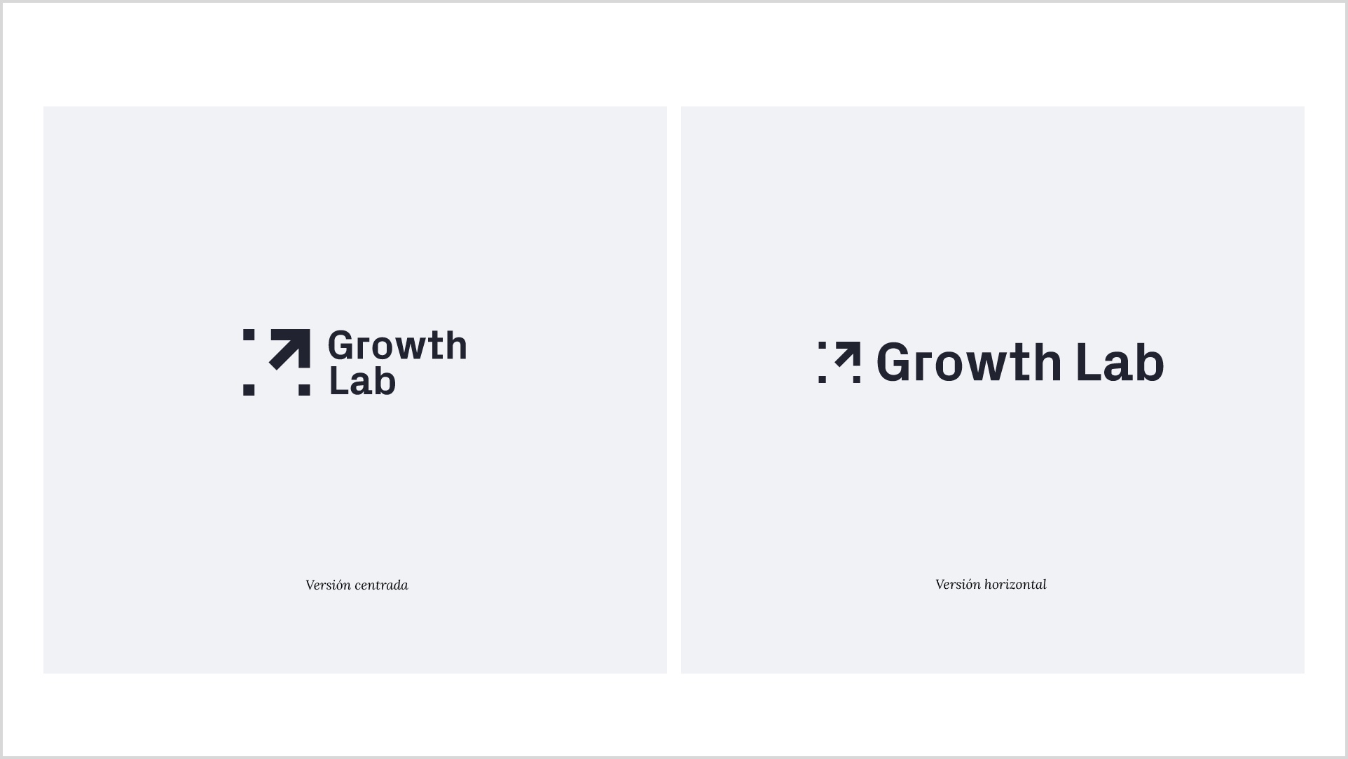
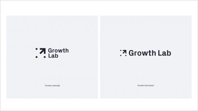
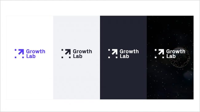
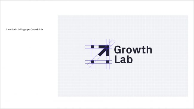
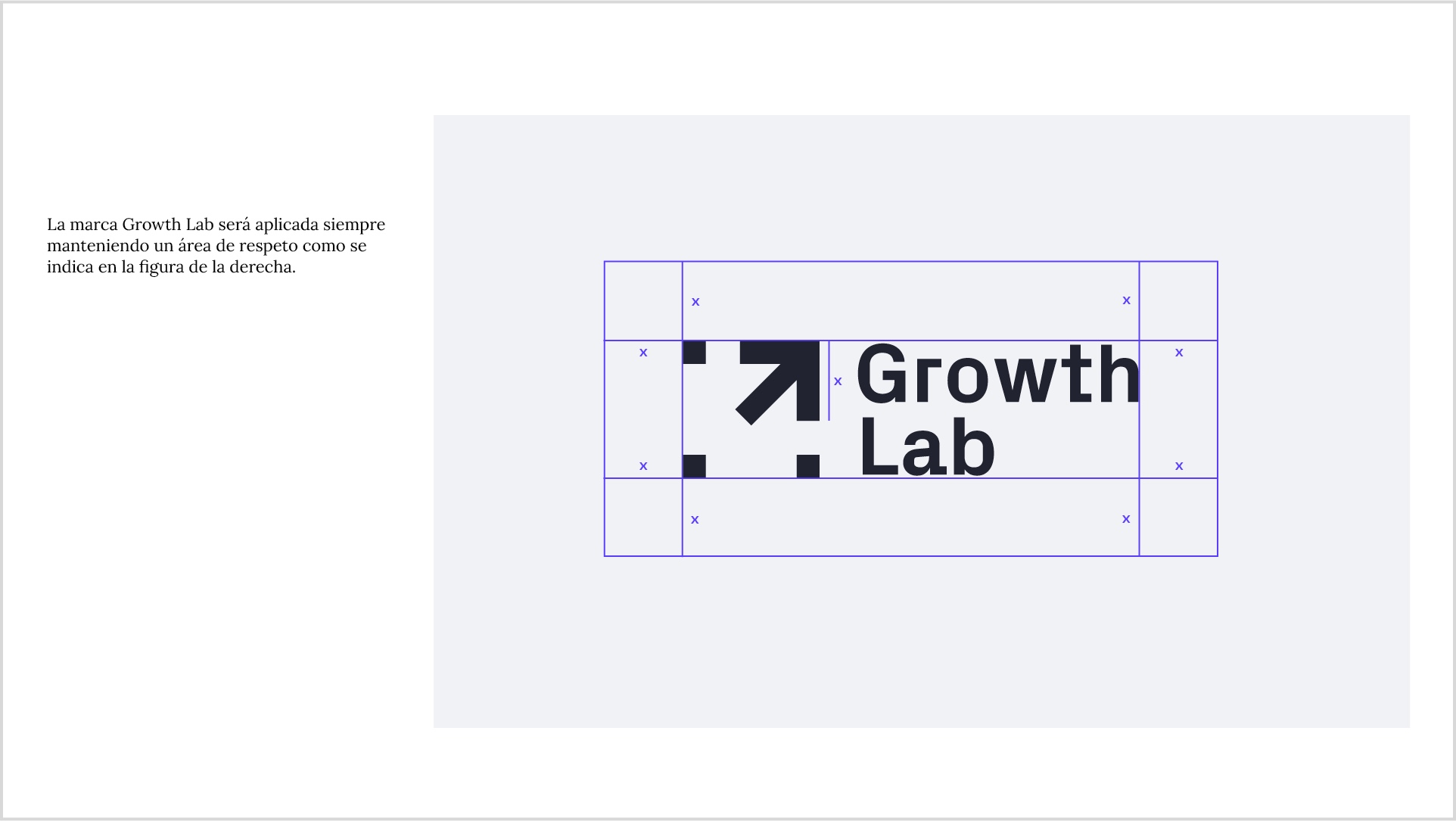
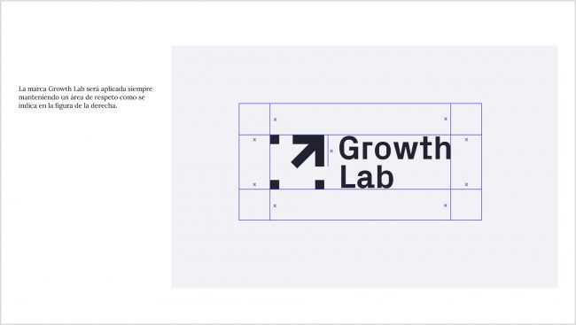
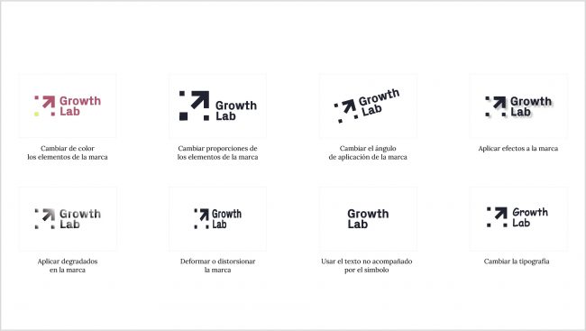
Logo & color scheme
Once the strategic part was completed I started working on the company’s visual identity. My main ideas for the logo revolved around the concepts of scientific research, data analysis, growth & transformation.
Growth Lab’s color palette consists of three primary and three secondary colors, together with their gradient-style combinations.


Typeface
I selected a combination of two contrasting typefaces to better reflect Growth Lab´s personality:
- Space Grotesk as the primary type. A sans serif font, characterized by good readability, giving the brand a sleek and modern look, with a hint of monospace geekiness. Used mainly for: titles, headers, prominent paragraphs, subtitles, buttons & navigation.
- Lora as the secondary type. A well-balanced contemporary serif with roots in calligraphy, well suited for body text and optimized for screen appearance. Aiming to convey trust and respectability due to its classical nature. Used for: body copies, captions, footnotes
Additionally, I picked two alternative fonts:
- DM Sans as the Google Workspace alternative of Space Grotesk, a low-contrast geometric sans serif design.
- Arial as the email alternative for both Lora & Space Grotesk.


Iconography
I chose an icon set called Blocky Icons, designed by Afnizar Nur Ghifari.
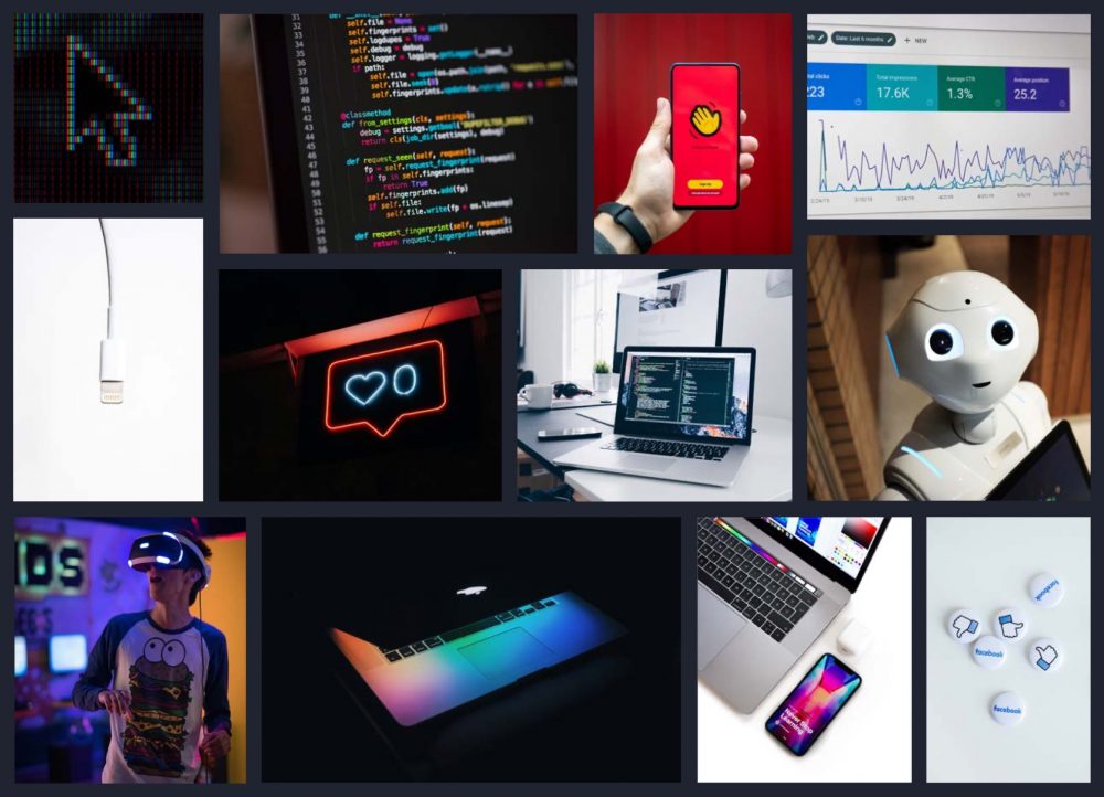
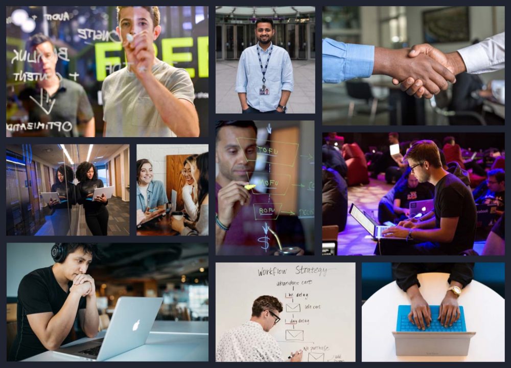
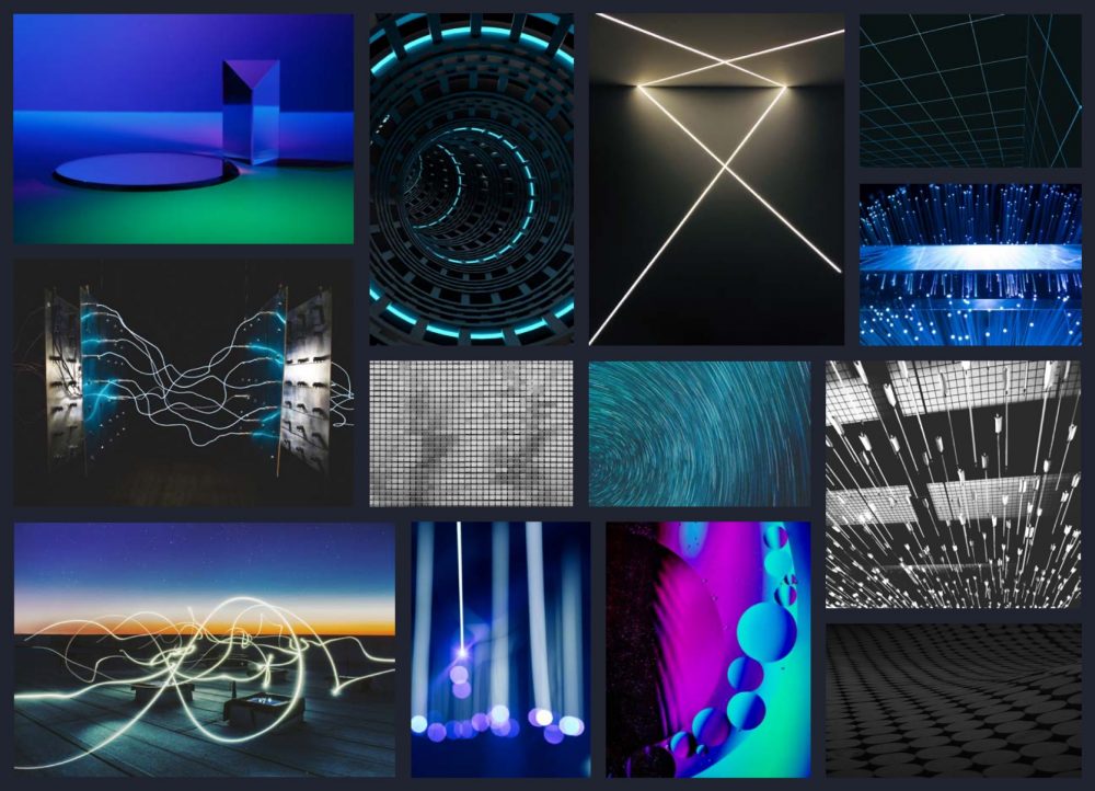
Photography
Brand photography mood boards got separated into three main categories: Marketing & Technology, People, Abstract.


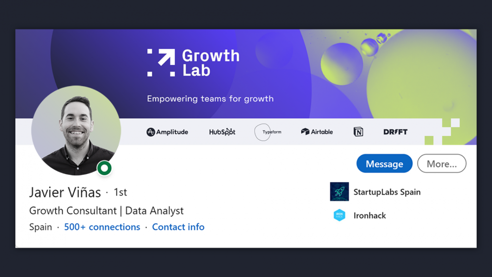
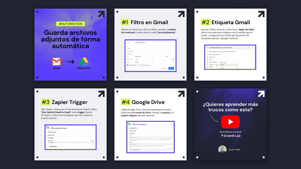
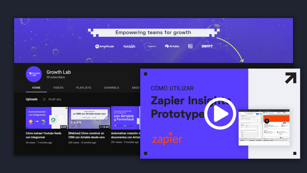
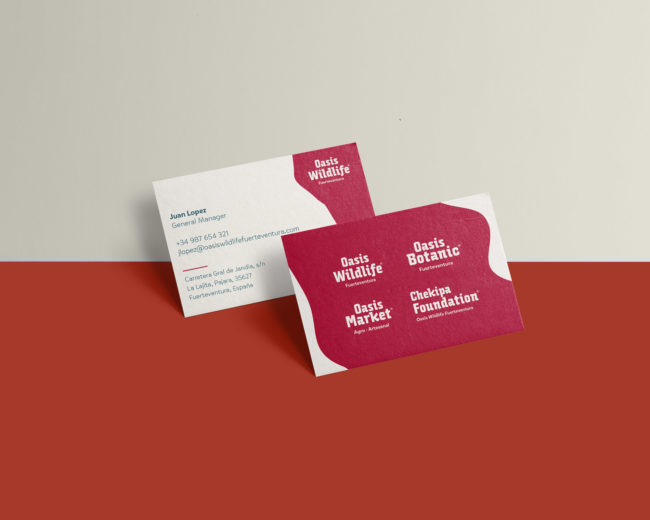
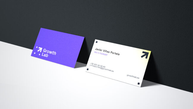
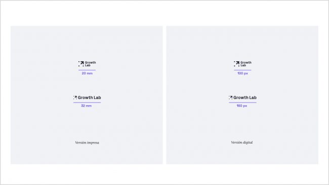
Brand Applications
Even though the brand functions primarily in the digital environment it needed a few print-ready staples, such as business cards or document & invoice templates. The rest of the brand applications got prepared for its main online communication channels: Youtube and Linkedin.